Preparing Artwork for Printed Stage Scrims: Scale, Color and Placement
Good artwork for printed stage scrims starts with the real proportions of your drop, high-resolution or vector files, colors chosen with the lighting plan in mind, and logos kept clear of hems, pockets and masking. Customized Stage Scrims checks all of this in a free mockup within 24 hours, so you can fix problems before any fabric is printed.
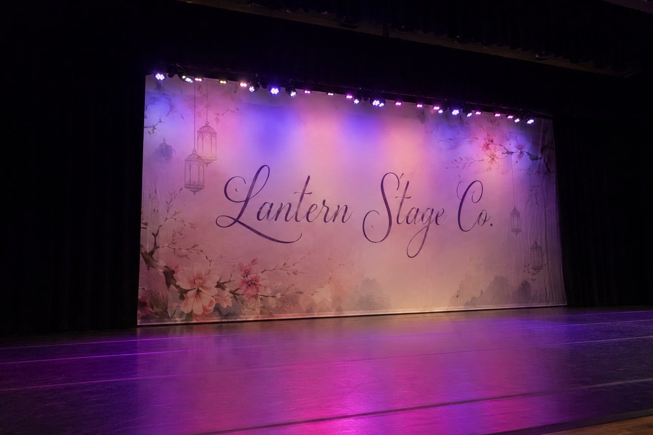
- Build the file at the finished proportions of the drop, not a screen shape
- Vector logos and original photo files hold up best at stage scale
- Front light, back light and fabric weave all change how printed color reads
- Free mockup within 24 hours and unlimited free revisions before you pay
- Minimum order 12; standard turnaround about 2 weeks after approval
What makes artwork for a printed stage scrim different from artwork for a poster?
Artwork for printed stage scrims is different because the image is enlarged to fill a proscenium, viewed from the house rather than at arm’s length, and seen through stage light instead of room light. A layout that looks crisp on a monitor can fall apart when it becomes a full-stage drop, and a color that reads well on paper can shift once front light, back light and haze hit the fabric.
Three things change when a design moves from screen to stage. Scale magnifies every flaw, so soft edges and compression artifacts become obvious. Viewing distance works in your favor, because audiences in the middle of the house see broad shapes far more than fine texture. And the fabric itself takes part in the image: an open-weave sharkstooth scrim, a solid muslin drop and a poly stretch surface all hold ink and light differently.
Treat the scrim file as a piece of scenery, not a graphic. Start with the stage picture you want the audience to see, then build the artwork around the fabric, the lighting plan and the hanging hardware.
How should you set up the canvas size and proportions for a custom scrim?
Set up the canvas for custom stage scrims at the exact finished proportions of the drop, using the width and height you measured for the opening plus any extra you want for overlap or trim. Matching the proportions first prevents the most common artwork problem: a design that has to be stretched or cropped to fit the real shape of the stage.
Build the file at full finished size or at a clean scale of it, and note which one you used when you send it. Leave room at the top for the webbing and grommets or tie line, and at the bottom for the pipe pocket or chain pocket, because those finishes fold or cover fabric. Keep logos, faces and lettering away from those edges and away from the sides where legs or masking may hide them.
- Match the finished width-to-height shape before placing any artwork.
- Mark a safe zone inside the top finish, the bottom pocket and the side masking.
- Extend background color or imagery past the trim so nothing ends in a hard white edge.
- Tell the team whether the file is full size or scaled.
If you have not measured yet, the site’s guide to measuring your stage walks through it before you open a design program.

Does image resolution matter if the audience sits far from the stage?
Image resolution still matters for printed stage scrims, but the right target depends on how close the nearest viewer sits. A drop seen only from the house can use lower effective resolution than a backdrop at a photo wall, a trade show booth or a small black box where the front row is close to the fabric.
Vector artwork is the safest choice for logos, type and flat graphic shapes because it scales to any size without losing edge quality. Photography and painted textures are raster images, so start from the largest original you have rather than a web download or a screenshot. Upscaling a small image adds pixels but not detail, and the blur becomes visible across a full-stage drop.
| Artwork element | Best source | What to avoid |
|---|---|---|
| Logos and lettering | Vector file from the original designer | Logos copied from a website |
| Photographic scenery | Largest original camera or stock file | Compressed social media images |
| Painted or illustrated scenes | High-resolution scan or native layered file | Phone photos of the painting |
| Flat color fields | Built as vector shapes or solid fills | Gradients saved with heavy compression |
When you are unsure whether a file will hold up, send it anyway. The mockup stage is where resolution problems are caught before anything prints.
How do stage lighting and fabric change the colors in your scrim artwork?
Stage lighting and fabric change scrim artwork colors more than most first-time buyers expect. Colored gels, LED fixtures and the color temperature of front light all tint the printed image, and open-weave fabrics let some of the background show through, so the drop never looks exactly like the file on your screen.
A sharkstooth scrim is a good example. Lit from the front, the printed image reads as a solid picture. Lit from behind, the image fades and the scene upstage appears, which means the artwork has to work as a partial, see-through layer too. Muslin and printed cyclorama fabric are denser and hold color more like a large print, while a rear-projection surface needs lighter, cleaner artwork so projected content is not fighting the printed layer.
- Expect saturated colors to shift under strongly gelled light.
- Use higher contrast than you would for print, since haze and distance soften edges.
- Keep critical brand colors in areas that receive neutral front light.
- For see-through effects, design the image to read even when partly transparent.
Share your lighting intent with the design team. Knowing whether a drop will be front lit, back lit or both helps the mockup reflect how the scrim will actually be used.
Where should logos and text go on a backdrop or cyclorama?
Logos and text on stage scrims and cycloramas should sit in the zone the audience actually sees, usually the upper middle of the drop, clear of performers, set pieces, risers and masking. Lettering placed too low disappears behind a band or a podium, and lettering placed too wide gets cut off by the legs.
Think about sightlines from the worst seats, not the best ones. Balcony seats see more of the stage floor and less of the top border, while side seats lose the edges of the drop behind the legs. For an event backdrop that will be photographed, keep the logo at a height that appears behind standing speakers rather than above their heads.
Text should be short and large. A single word mark or a short tagline reads from the back of the room; a paragraph does not. Avoid thin script fonts and tightly spaced lettering, which blur at a distance and on open-weave fabric. If one show needs several looks, consider separate drops or a projection-friendly surface rather than crowding every message onto one printed scrim.
What are the most common artwork mistakes on a first scrim order?
The most common artwork mistakes on a first order for stage scrims are the wrong proportions, low-resolution images, important content placed in the hem or pocket, and colors chosen without considering the lighting. Each one is easy to fix in the file and very hard to fix once the fabric is printed.
- Designing to a screen shape instead of the stage. A widescreen slide rarely matches a proscenium opening, so the design ends up stretched or cropped.
- Using web images. Logos and photos pulled from websites are too small to enlarge cleanly.
- Ignoring the finishes. Webbing, grommets and pipe pockets cover or fold part of the fabric.
- Forgetting the masking. Legs and borders hide the edges of the drop from most seats.
- Choosing thin lettering. Fine type disappears at a distance and on open weaves.
- Skipping the lighting conversation. A design meant for back light looks different under front light alone.
- Approving too fast. Check the mockup at small size, the way a back-row viewer sees it.
A careful mockup review catches nearly all of these. Look at the proof zoomed out, check every edge, and ask for changes before you approve.
How does the mockup and proof process work at Customized Stage Scrims?
Customized Stage Scrims returns a free mockup within 24 hours of receiving your artwork or idea, and you pay nothing until you approve the design. Revisions are unlimited and free, so the proof stage is the right time to test placement, scale and color before the drop goes into production.
Send what you have: finished files, a rough sketch, a reference photo of a set, or just the stage dimensions and a description of the look. The team places the artwork on the correct fabric and finish, flags anything that may not hold up at full size, and shows you how the drop sits in the opening.
- Minimum order is 12 pieces, which suits touring productions, multi-venue events and branded sets that need matching drops.
- Standard turnaround is about 2 weeks after approval, with faster turnaround available through express shipping.
- Every piece in a run can carry the same artwork, or you can vary the artwork across the order when venues or scenes differ.
When your file is ready, start a request on the quote page and include the fabric you have in mind, the finished size, the hanging method and the date you need the scrim on stage.
Frequently asked questions
Can I send a rough sketch instead of finished artwork for a stage scrim?
Yes, a rough sketch works as a starting point for stage scrims. Customized Stage Scrims can build a mockup from a hand drawing, a reference photo of a set, or a written description of the look you want. The design team turns that into a properly proportioned layout for your drop, and you review and revise it for free before approving anything for production.
Should scrim artwork be designed for front light, back light or both?
Scrim artwork should be designed for however the stage scrim will actually be lit in the show. Front light makes a printed image read as solid, while back light fades the image and reveals the scene behind. If a reveal is planned, build artwork that still reads when partly transparent, and tell the design team the lighting plan so the mockup reflects it.
How large should lettering be on a printed stage backdrop?
Lettering on a printed stage backdrop should be large enough to read comfortably from the back row, which usually means bold, short words rather than sentences. Thin scripts and tightly spaced type blur at a distance and on open-weave scrims. Customized Stage Scrims shows your lettering in the mockup so you can judge legibility before approving the final drop.
Can a logo sit near the bottom edge of a scrim?
A logo near the bottom edge of a scrim is risky because the pipe pocket or chain pocket folds that fabric, and performers, risers or set pieces often block the lower part of the drop. Placing the logo in the upper middle keeps it visible from more seats. The mockup marks the safe zone so placement problems show up early.
Will a photo from our website print clearly on a full-stage scrim?
A photo pulled from a website rarely prints clearly on a full-stage scrim because web images are compressed and sized for screens. Enlarging one across a drop exposes blur and blocky artifacts. Send the largest original camera, stock or scan file you can find, and Customized Stage Scrims will flag any image that may not hold up at stage scale.
Do side legs and borders hide part of the scrim artwork?
Side legs and borders do hide part of the scrim artwork from many seats, especially at the edges of the house. Keep logos, faces and important scenery inside the visible opening rather than at the outer edges. Extending the background past the masking line still matters, so the drop never shows a hard edge when sightlines shift.
Can different scrims in one order carry different artwork?
Different scrims in one order can carry different artwork, which helps touring shows, multi-room events and productions with several scenes. Customized Stage Scrims prepares a mockup for each version so you can approve them individually. The minimum order of 12 applies to the run, and every piece follows the same approval-first process.
How should artwork account for webbing, grommets and pipe pockets?
Artwork for stage scrims should leave a clear margin where webbing, grommets and pipe pockets sit, because those finishes fold, cover or puncture the fabric. Keep text and logos well inside those areas and let only background color run into them. The Customized Stage Scrims mockup shows the finishes in place so nothing important lands in a hem.
Does an open-weave sharkstooth scrim print fine detail as well as muslin?
An open-weave sharkstooth scrim holds broad shapes and bold contrast better than fine detail, because the mesh lets light pass through between threads. Solid muslin and printed cyclorama fabric reproduce small detail more like a large print. Choose the fabric for the effect you need, then simplify artwork for open weaves where tiny texture would be lost.
How should I review a scrim mockup before approving it?
Review a scrim mockup by viewing it zoomed out to the size a back-row audience member would see, then checking every edge for content near hems, pockets and masking. Confirm colors with the lighting plan in mind and read every word aloud. Customized Stage Scrims offers unlimited free revisions, so request changes until the drop looks right.
Can I hang a printed scrim upside down or reverse it for a different look?
A printed scrim is designed to hang one way, because the top webbing, the bottom pocket and the artwork orientation are built together. Reversing it would put lettering backward for the audience and hardware in the wrong place. If a production needs two looks, order separate stage scrims or ask about a double-purpose design during the mockup stage.
Get a free mockup for your stage scrims
Send your logo or idea and the quantity you have in mind. Customized Stage Scrims returns a free mockup within 24 hours, you approve the design before anything is produced, and standard turnaround is about two weeks with faster options available. Get a custom quote.
Win Free Stuff
Enter below for a chance to win plus receive 10% off your first order.
🎉 You are in!
We will text you your 10% off code. Good luck!